React components
Install @ies-tools/viewer, three, react and react-dom after publication. The React exports live at @ies-tools/viewer/react; the core package is usable separately in Node and browsers.
import { useState } from 'react';
import { parsePhotometry, type PhotometricDocument } from '@ies-tools/core';
import { LightViewer, IntensityGraph } from '@ies-tools/viewer/react';

export function Photometry() {
  const [document, setDocument] = useState<PhotometricDocument>();
  const profile = document?.profile;
  return (
    <>
      <input
        type="file"
        accept=".ies,.ldt"
        onChange={async (event) => {
          const file = event.target.files?.[0];
          if (file) setDocument(parsePhotometry(await file.text()));
        }}
      />
      <LightViewer document={document} exposure={1} onError={console.error} />
      {profile && <IntensityGraph profile={profile} projection="topology" upAxis="y" />}
    </>
  );
}
Catch parsing errors in your application to present invalid file feedback. The demo in packages/website includes error handling and controls for exposure and graph settings. It uses Vite, React and the React Compiler.
LightViewer
| Prop | Meaning |
|---|---|
document | Shared PhotometricDocument preserving native IES/LDT provenance; highest precedence |
profile | Parsed compatible IESProfile, taking precedence over text and URL sources |
text | Raw IES or EULUMDAT source text; format is detected automatically |
iesText | Compatibility alias for raw text |
src | URL fetched with cancellation when the component unmounts or the source changes |
format | Optional explicit ies or ldt input hint |
lampSetIndex | Zero-based LDT alternative configuration; required when several lamp sets exist |
exposure | Nonnegative display exposure, default 1 |
onLoad | Called with (profile, { document, sourceFormat }); existing one-argument handlers still work |
onError | Called with an Error; errors are also shown in the component |
className, style | Wrapper styling; default height is 480 pixels |
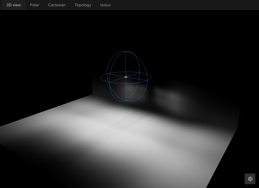
The Three.js scene has a black background, floor, wall and a downward-facing luminaire above the floor. Orbit with a drag and zoom with the scroll wheel. The renderer samples the Type C intensity table and applies inverse-square falloff and receiver cosine. This is a direct diffuse preview; it does not compute room interreflection or fixture geometry shadows. WebGL2 is required.
IntensityGraph and IsoluxGraph
IntensityGraph supports complete opposed-plane polar cuts, principal-plane overlays, labeled Cartesian curves and filled or wireframe intensity topology. Existing axis, angle and upAxis props remain available. IsoluxGraph computes a ground-plane lux heatmap and contours with configurable mounting height, extent and fixture aiming.
<IntensityGraph profile={profile} principalPlanes />;
<IntensityGraph profile={profile} projection="cartesian" planes={[0, 45, 90]} />;
<IntensityGraph profile={profile} projection="topology" surface="both" upAxis="z" />;
<IsoluxGraph profile={profile} mountingHeight={3} extent={[12, 8]} aimAngle={30} />;
Import both components from @ies-tools/viewer/react. See Photometric graphs for the complete prop reference, coordinate conventions and the pure chart data APIs in @ies-tools/core. The SVG graphs require no GPU; the 3D light scene requires a real hardware GPU.
IES and EULUMDAT sources
LightViewer selects sources in this order: document, profile, text, iesText, then src. document passes the normalized profile directly to the renderer and retains native source data; it never serializes LDT into IES text to display it. Supplying only a compatible profile retains the legacy IES API but cannot recover native LDT geometry or provenance that the caller has discarded.
<LightViewer
  src="/lights/luminaire.ldt"
  format="ldt"
  lampSetIndex={1}
  onLoad={(profile, info) => {
    console.log(profile.candelaValues, info.sourceFormat, info.document.source);
  }}
/>
Lamp sets in LDT are alternative configurations, not values to add together. Single-set files need no selection. For multiple sets, pass an explicit zero-based lampSetIndex, or parse the native file with parseLDT and provide a selector before calling parsePhotometry. The browser demo shows this flow. The simple upload example above deliberately reports an error for a multi-configuration file until your application supplies a choice.
Changing a source cancels its previous fetch and suppresses stale completions and errors. Unmounting also cancels loading and releases the viewer. Format hints and selected lamp configurations participate in the same lifecycle. The supported rendering coordinates remain Type C for both source formats.
Scene settings
LightViewer also accepts showWall, wallDistance, floorDistance, toneMapping, exposure and helper props. These update the current renderer without reloading the source. onSettingsChange({ settings, previousSettings }) observes effective changes. Defaults are a visible wall, 2-meter wall/floor distances, ACES tone mapping and exposure 1. The built-in gear overlay uses the same ViewerSettingsPanel React component as the custom element. settingsPanel="closed" (default), "open" or "hidden" controls its initial display. Source changes retain the current renderer and user-selected scene settings; changing provided scene props applies only those values. Omitted props leave the current panel setting intact; removing a previously provided prop keeps its current value and lets the panel control it.
Shared viewer styling
import '@ies-tools/viewer/styles.css';
import { LightViewer, ViewerSettingsPanel } from '@ies-tools/viewer/react';

<LightViewer src="/luminaire.ies" settingsPanel="closed" />;
The compiled stylesheet supplies Tailwind utilities and the shared theme tokens. A .dark ancestor uses the dark palette. Applications already compiling Tailwind v4 can instead import @ies-tools/viewer/styles/viewer.css into their Tailwind entry. ViewerSettingsPanel is independently reusable with settings, mode, onChange, onModeChange and optional onError props. Its component is shared with the element, so controls do not drift between embedding surfaces. See Styling and themes.
Shared inspection UI
PhotometryInfoPanel and ValidationChecks are exported from @ies-tools/viewer/react. They render the shared core inspection and validation models used by the CLI. Import the compiled @ies-tools/viewer/styles.css, or include @ies-tools/viewer/styles/viewer.css in a Tailwind v4 entry stylesheet, then override the documented theme tokens for your host. The VS Code preview maps those tokens to editor colors.
See the @ies-tools/viewer/react API reference for every component and prop, generated from the source's TSDoc comments.